I watched in awe as Giulia placed my bulging, crema-pumped cornetto into a paper bag imprinted with an elegant scroll font and an illustrated portrait of Empress Elisabeth “Sissi” of Austria. On the one rare occasion I had to enjoy my breakfast porta via, the delightful details on this packaging caught my attention–the regal logo that graced everything from my paper bag to porcelain cups and saucers, serviettes, even sugar sachets. What did Empress Sissi have to do with a Milanese pasticceria? I wondered. We will get to her story in a moment…
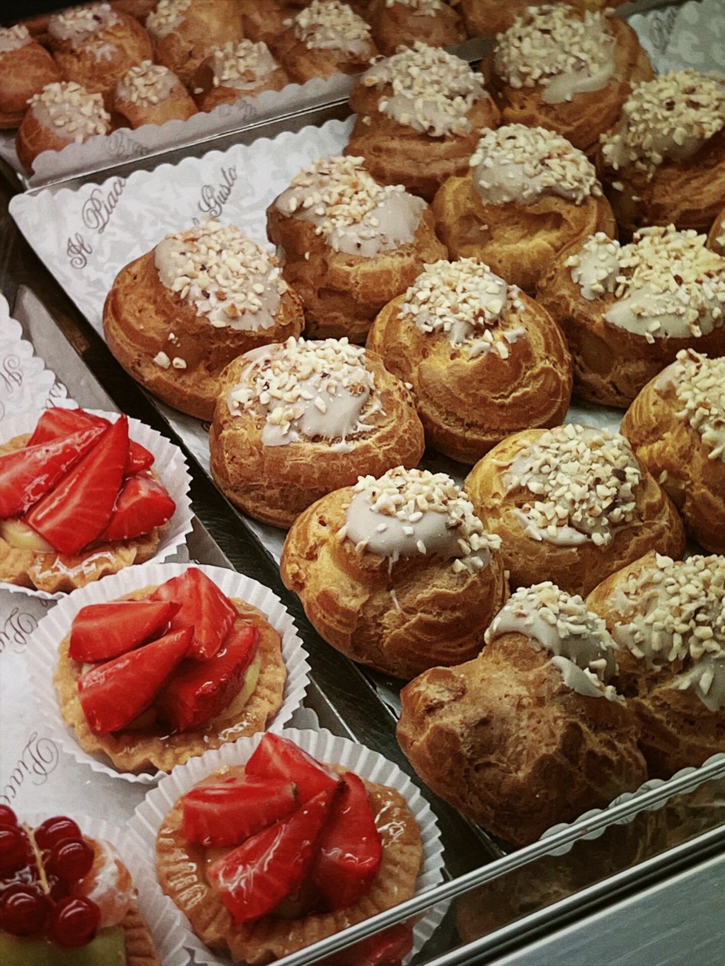
The artisanal splendour of Italy’s most iconic pasticcerie extends far beyond the experience of simply devouring the dolci. Whether elegant high-street institution or family-run neighbourhood gem, the visual identity of these beloved establishments is an artful expression of heritage and creativity that enchants customers from all over the world. Never a deliberate “branding” exercise, but rather a celebratory signature (good luck finding a plain, un-stamped serviette in Italy!), the logos, characters, fonts, shapes and signature colour palettes of each pasticceria combine to create intriguing company signatures that are, in themselves, good enough to eat.

GIOLITTI (ROME)
Every visit to Rome’s Giolitti (Antica Gelataria e Pasticceria dal 1900) is a piped, iced and whipped whirlwind of “Dio, Gio, where do I look first?!” To start, the larger-than-life white and green GIOLITTI sign on Via degli Uffici del Vicario welcomes you with gusto. The Art Nouveau-style curves of its font suggest a cinematic exuberance from an era when Sophia Loren and Anita Ekberg sauntered Rome’s streets in search of a mouthful of mignon.
Their story began in 1890, when Giuseppe and Bernardina Giolitti opened a dairy in the pastures of Rome’s countryside. A few years later, the couple opened the company’s now-famous headquarters in the heart of Rome–a decadently furnished gelateria and pasticceria with a chandelier-clad dining parlour. Giolitti’s official branding, however, wasn’t created until 1970 when artistically-minded Silvano Giolitti (the third-generation to work in the shop) designed the company’s logo. Instantly recognisable and guaranteed to warm the hearts of children (and grown-up children), the logo features a silhouette of the now world-famous Giolitti ice cream cup and cake, illustrated in the company’s signature shade of green. Not quite forest green, not quite emerald, the colour reflects Giolitti’s heritage of using quality and artisanal ingredients in all their products: “Our green is symbolic of freshness. It’s related to nature and Giolitti’s pastoral origins. It represents the fact that we use only natural ingredients and we make everything by hand,” says Nazzareno Giolitti, fourth-generation Giolitti and chairman of the company’s board. “The logo also pays homage to the Giolitti Cup and the Giolitti Cake, created by the second generation in 1920,” he adds.
More about this logo’s heroes: the Giolitti Cup, or Coppa Giolitti, is the company’s most famous menu item–a dairy extravaganza piled with chocolate ice-cream, custard and chilled zabaione, topped with lashings of cream and a long tube-wafer cookie that reaches towards heaven. The Giolitti Cake, or Torta Giolitti, is the classic ice-cream cake covered with chocolate fondant, which, on a sweltering Roman afternoon, has hordes of tourists, locals and Chamber Deputies lining up for a face full. Would a Giolitti experience really be a Giolitti experience if your dairy-of-dreams wasn’t served on a scalloped-edged piece of paper stamped with that charming green trademark? Perhaps not!
PASTICCERIA SISSI (MILAN)
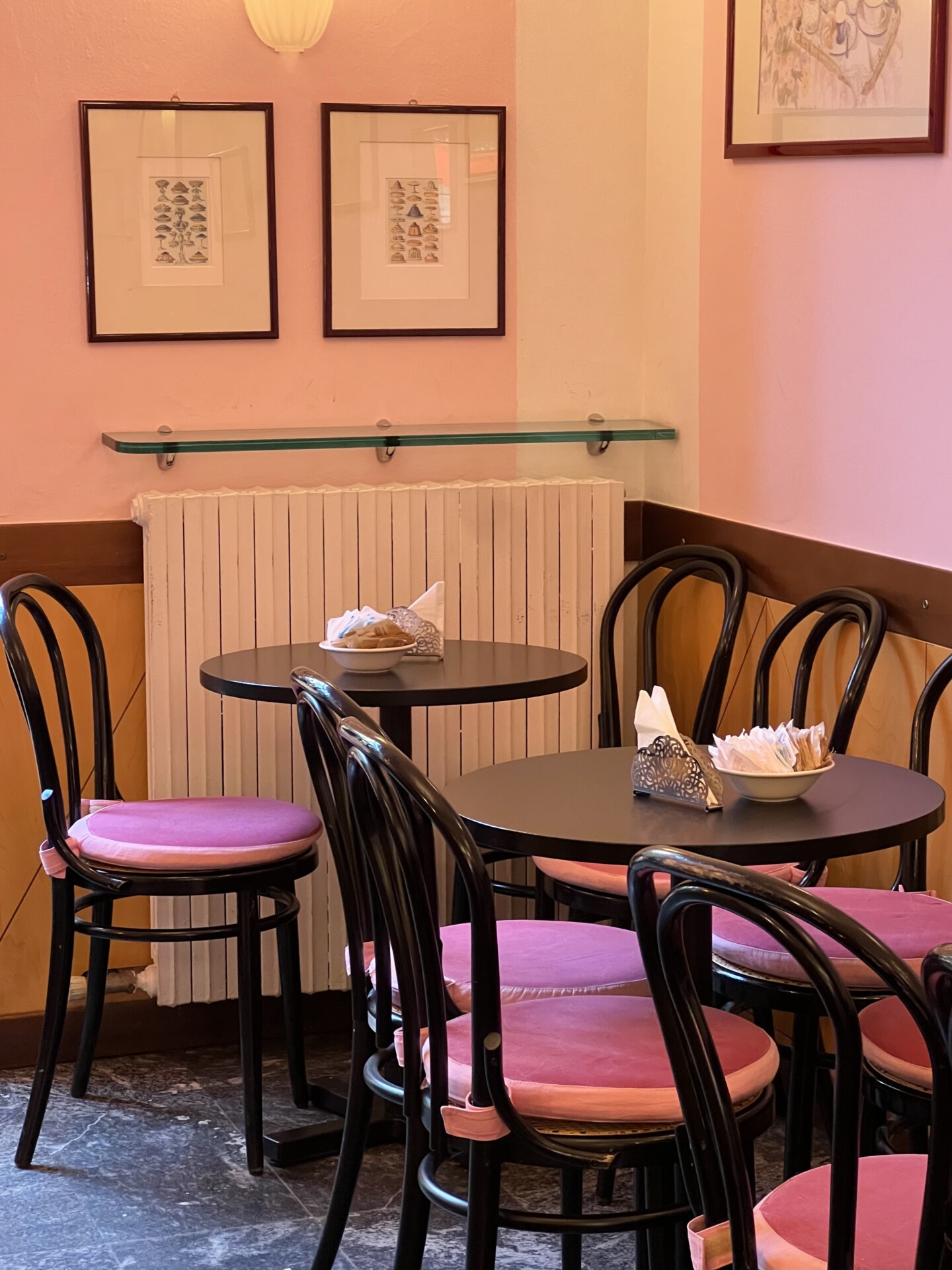
Meanwhile in Milan at Piazza Risorgimento, we are reunited with Empress Sissi on my paper bag and sugar sachet. Her eyes are as warm as the aromas of butter and vanilla that embrace you the moment you walk through the door, stepping into what feels like a scene from a Wes Anderson film. With its candy-pink walls and wooden décor, family-run Pasticceria Sissi is like a visit to Sissi’s own home for a caffé and one of Milan’s favourite, hand-pumped brioches. As I eventually discover, answering my longstanding question, it’s all in the name:
“When she was expecting my mother, my grandmother loved the film Sissi (1955), which is based on Princess Elisabeth of Bavaria, nicknamed ‘Sissi.’ When my mother was born, Sissi also became her nickname, and it stuck with her as she grew up. People simply call her Sissi now. She decided to use the name and the figure of this Empress as part of the creative identity of the shop when she opened it over twenty-five years ago,” says Sissi’s son Maleye Faye. This explains the pasticceria’s many personal touches–from its staff uniforms (button-through collared dresses, cardigans and bonnets) to its furnishings, and of course its branding, which draws from a mixture of references including flourishes of Bavarian royalty and decorative elements from 1930s bohemian Paris.


PASTICCERIA DAL NONO COLUSSI (VENICE)
A pair of lions awaits you over in Venice, where trays of Fugassa Veneziana (Venetian Focaccia, a yeasted sweet bread typically devoured at Easter) rise with the sun, deep in the ovens of Pasticceria Dal Nono Colussi. Designed in 1987 by Franco Colussi, the company’s striking blue and gold logo says as much about the city’s cultural nuances as it does about the Colussi family. Featuring two proud lions (Venice’s symbolic animal) standing upright on their hind legs with a Palo di Cascada (one of the city’s striped canal poles, a bold public expression of a family’s “colours” and status in the height of the Venetian Republic) between them, the logo represents the two Colussi brothers who first opened and ran the business together. Venice and gold: little explanation is required for the relevance of this timeless hue in depicting an artisanal city that has lusted after this precious metal for centuries, seen in every glinting cathedral dome, gilded portrait frame, hand-crafted Carnevale mask and wedding ring tossed into shimmering waters on the Festa della Sensa.
Third generation Marina Renato now runs Pasticceria Dal Nono Colussi today, working alongside her mother and grandfather Franco, who, at 87 years old, still works a few hours a day in the shop. Stamped on everything from biscuit packets to specially-made wrapping paper to the shop’s front door, the company’s logo illustrates a deep sense of pride in family and culture, and a commitment to an artisanal spirit that has continued to evolve over the decades.
“The business started in 1956, and it has always been carried on with a lot of hard work, sacrifice and seriousness. Every day we try to give nothing less than the best to our customers. The logo tells how the business started, and how it has continued,” says Marina.

CAFFÈ SICILIA (NOTO)
A cassatina siciliana at Noto’s Caffè Sicily is a glistening triumph from the outside-in: a toothsome sponge-ricotta-marzipan ratio that can only be perfected, as it has, through decades of refining a secret family recipe that is tinted a “fantasy” shade of pastel green to finish. Fourth generation Assenza family pastry chef and Caffé Sicilia co-owner Assenzo Corrado reflects on the company’s artisanal heritage, which has defined the culture of the Sicilian pasticceria since 1892, while also adopting a future-focussed vision ensuring continued innovation for generations to come. Caffé Sicilia’s story is one of natural evolution and multi-generational cycles, a narrative conveyed in the company’s visual branding. Its logo is subtle yet unmistakable–an elongated red oval segmented with three points corresponding to the three corners of Sicily’s geographical map. Changing in style and colours over the years, the current and more conceptual iteration was designed by architect and close friend of the company Chiara Spicuglia, featuring “Caffé Sicilia ” written in mustard font in the oval’s centre. With a hint of sleek 60s mod, the oval (the planet), the three coloured dots (Sicily’s location) and Noto (the home of Caffé Sicilia) are all represented on this nifty little graphic.
“We used characters, colours and fonts to link past and present of a historic company that, passing from generation to generation, always expresses contemporary freshness of thought and innovative choices of its own free and independent view of the world. It’s a vision beyond stereotypes,” says Corrado. Never an intentional branding exercise but something considered more a signature of Caffé Sicilia’s commitment to artisanal creation and innovation, you will find the company’s logo and visual identity on cups piled with a magenta mountain of Gelato di Ciliegia, on blood orange jam jars, and on nougat boxes spotted in the hot hands of tourists and locals all over Noto. As it turns out, Earth is not a sphere, it’s an oval, and one could only hope that you could cut it open to the cassata’s layers of sponge cake and ricotta instead of magma and mantle.
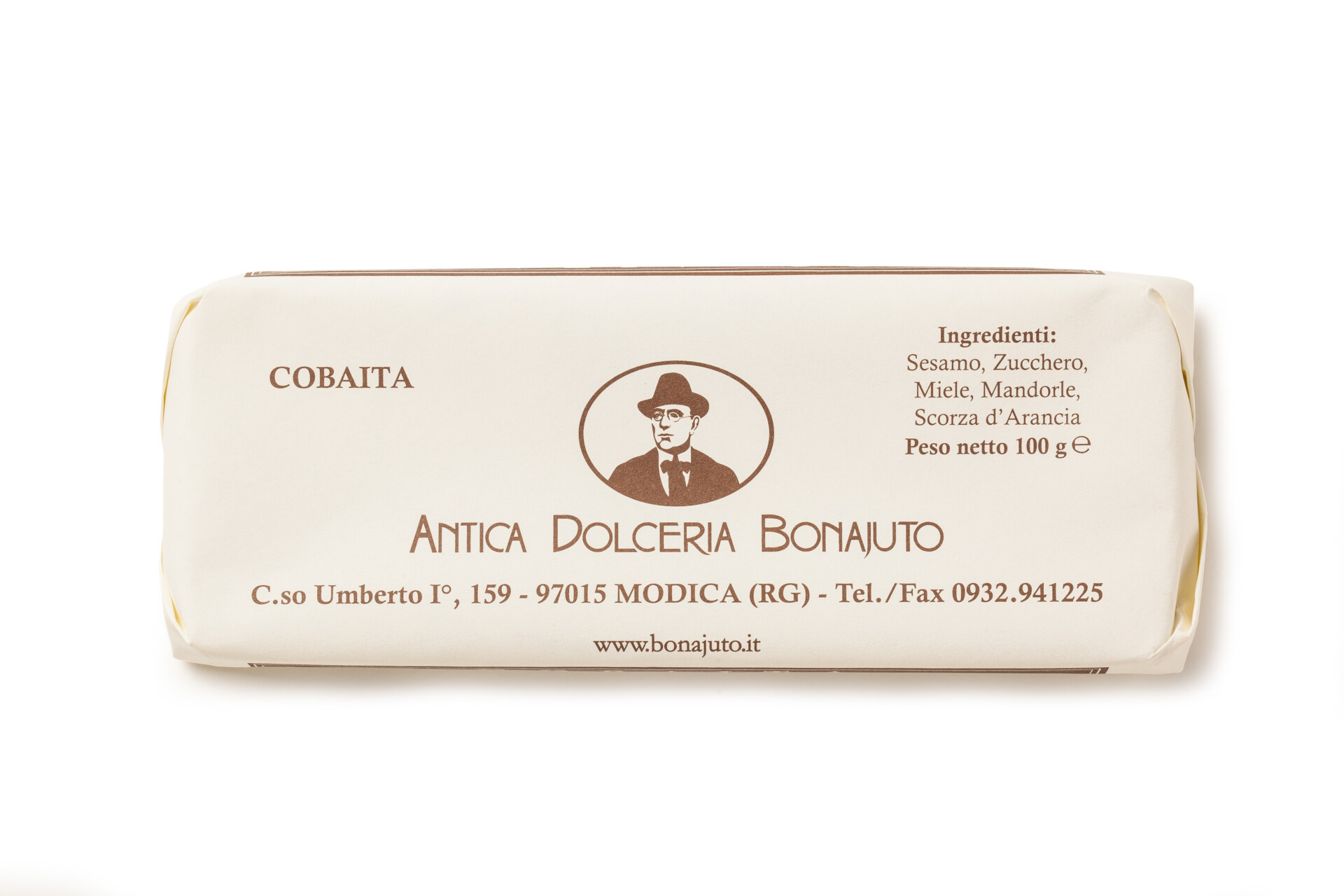
BONAJUTO (MODICA)
Still in the sweet south, it’s a treasure trove of Art Nouveau-style design elements and a signature shade of brown (Pantone 4626 to be precise) that defines the visual identity of Modica’s Antica Dolceria Bonajuto. Designed by illustrator Angelo Ruta in 1992, the confectionary shop and pasticceria’s logo features an illustrated portrait of the company’s founder Francesco Bonajuto, who started the business in 1880. He’s depicted wearing his signature fedora in the logo, which also features hand-drawn font referencing Sicilian Art Nouveau and, more specifically, the work of architect Ernesto Basil (the mastermind behind the design of Palermo’s Teatro Massimo in 1891, which exemplifies his signature style of fusing ancient, medieval and modern design elements). The branding is elegantly applied to everything including chocolate wrappers, gift boxes and even a line of merchandise offering posters and tote bags. According to Dolceria Bonajuto’s current owner Pierpaolo Ruta, the company’s visual identity is a further expression of its commitment to the art of storytelling, one that considers all aspects of a customer’s multi-sensory experience.
“Our mission remains unchanged over time: to create products whose simplicity is unforgettable. Our trademark is to both preserve and to create memories. Memory is our most powerful narrative: it tells of how we carry on tradition and how we innovate. Of how we look back while resiliently continuing to move forward. Our brand is made of memories and flavours, of scents and impressions. What we do every day identifies and represents us,” says Pieropaolo.
The art of the Italian Pasticceria starts long before the first bite. Before you ravenously tear open your paper bag of still-warm cornetto, pause for a moment to observe these branding details (if you can help yourself). It’s more than likely the colours, font and figures catching your eye represent a narrative of heritage, innovation and a deep commitment to an artisanal spirit that makes each mouthful even more momentous.