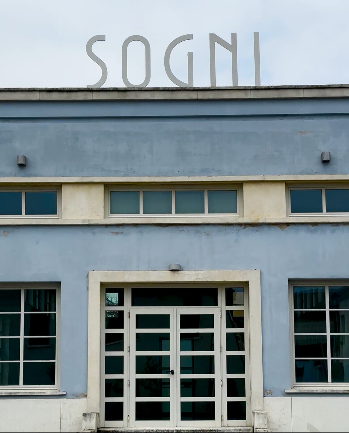
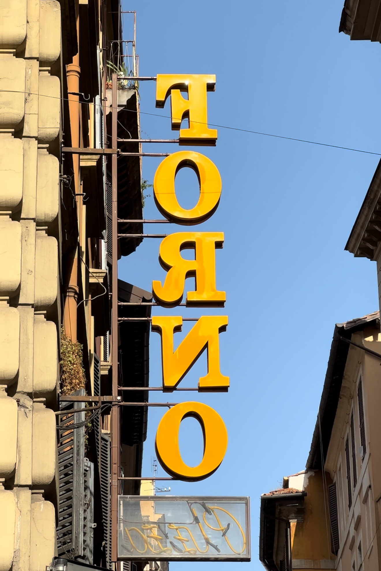
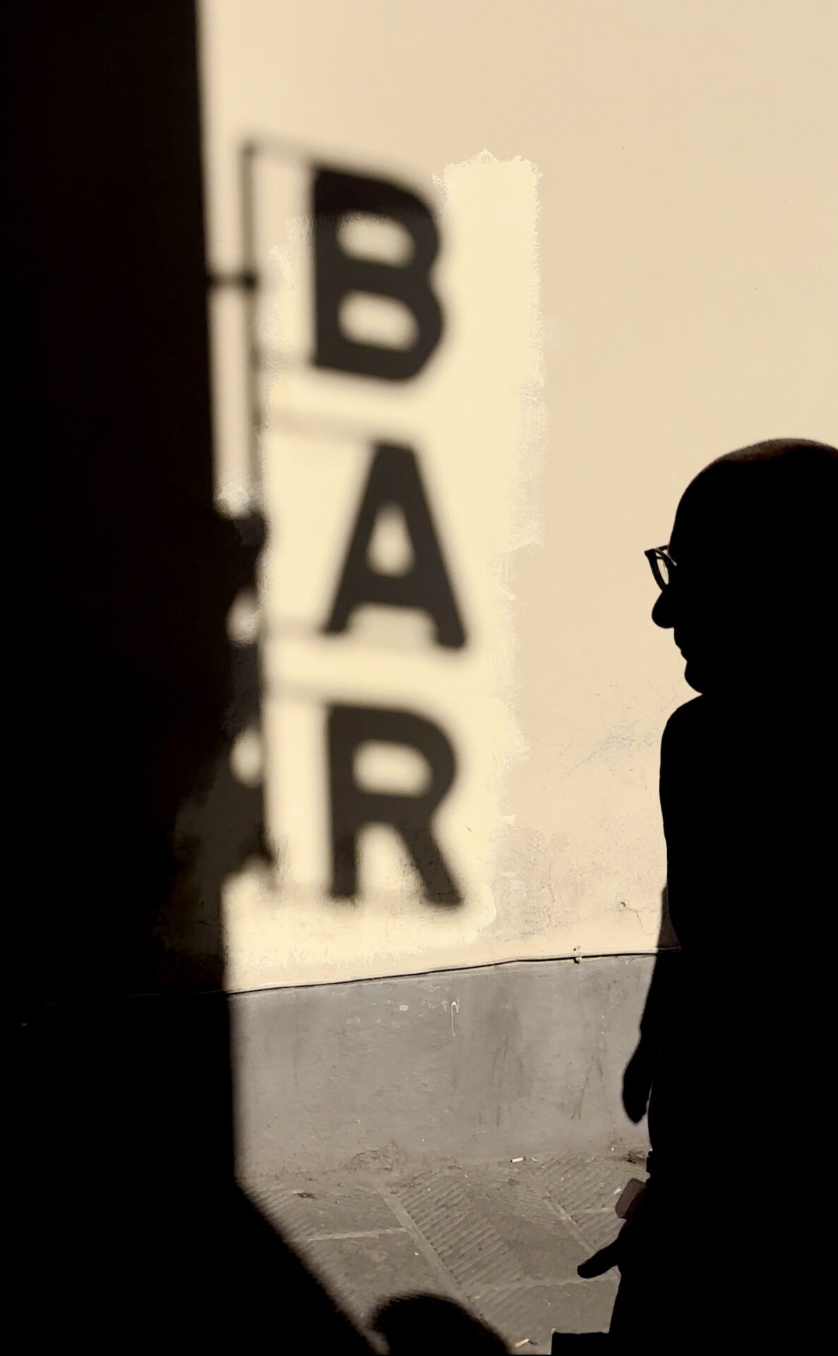
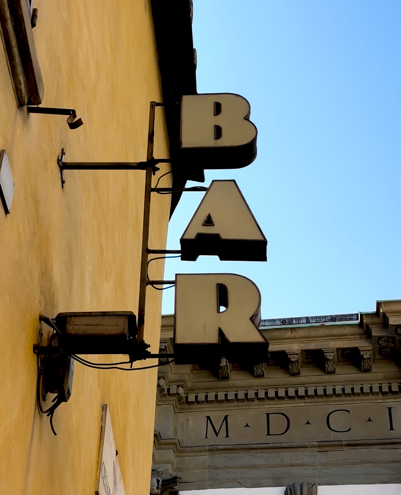
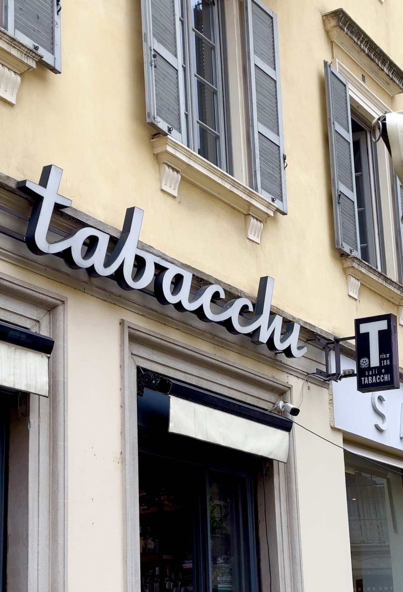
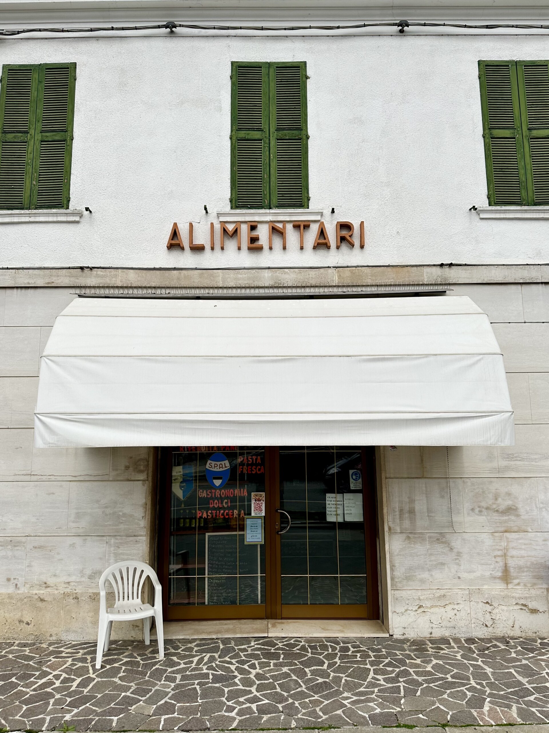
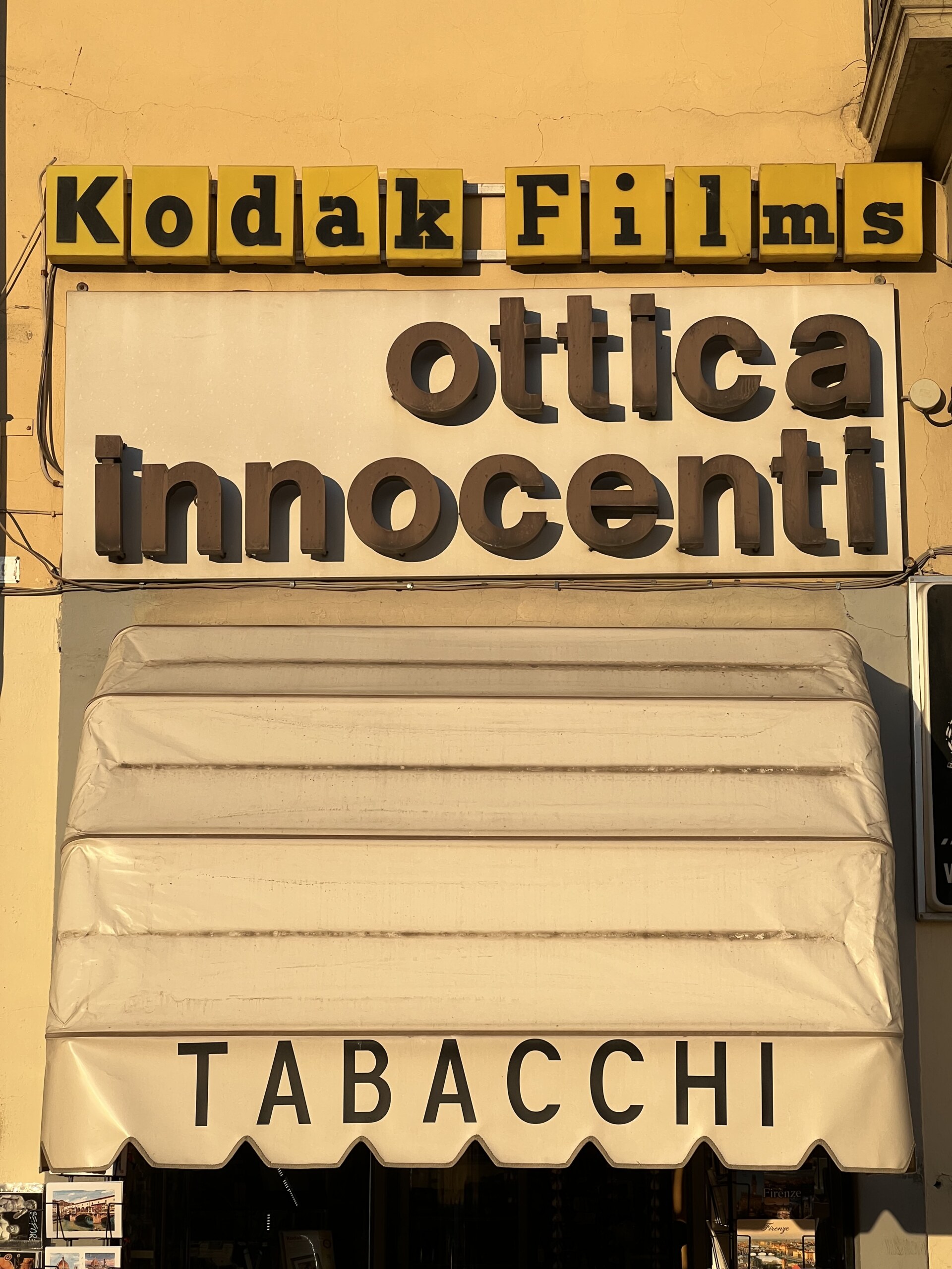
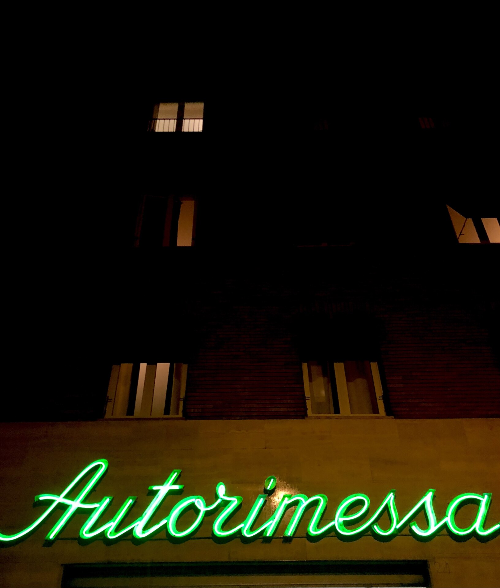
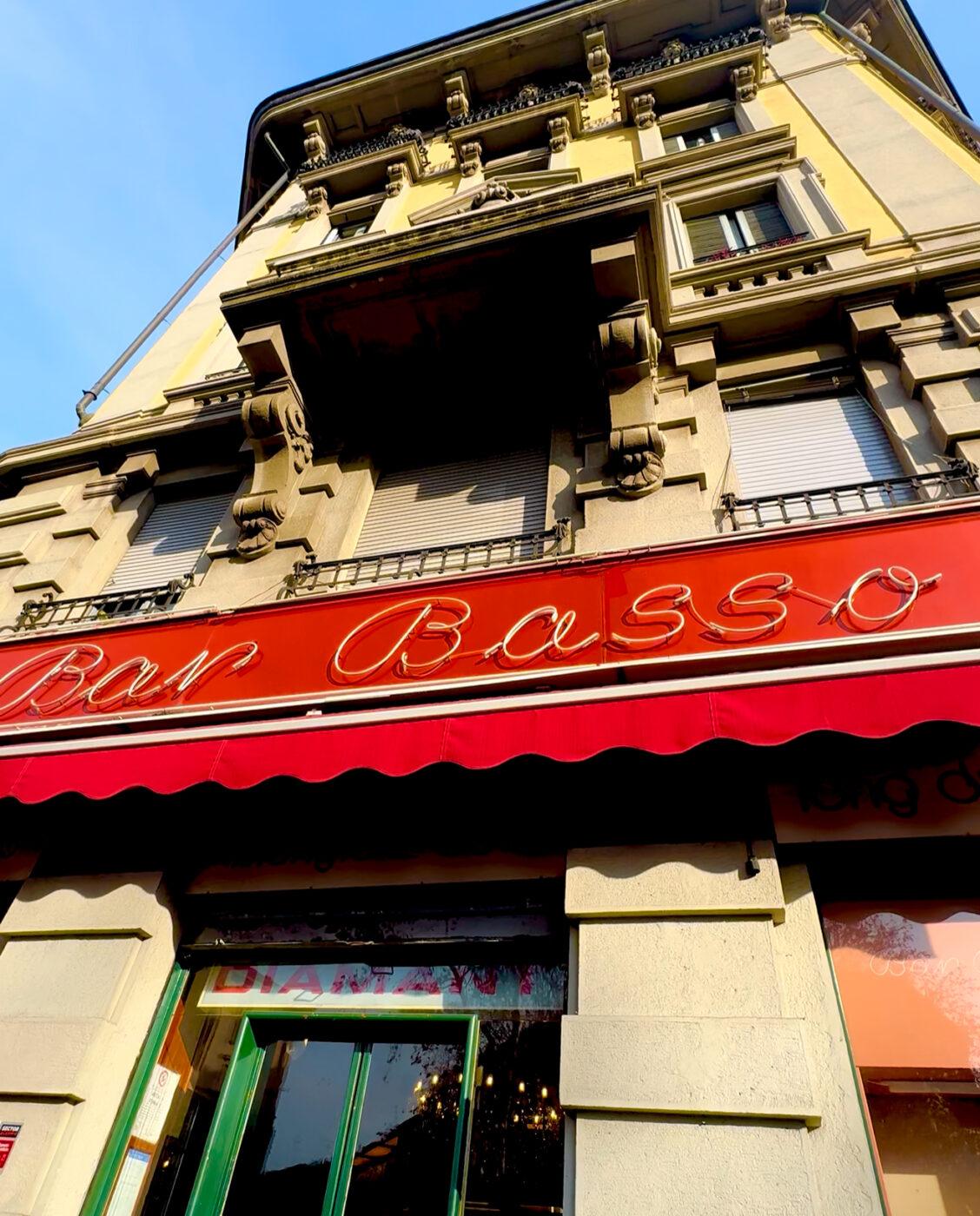
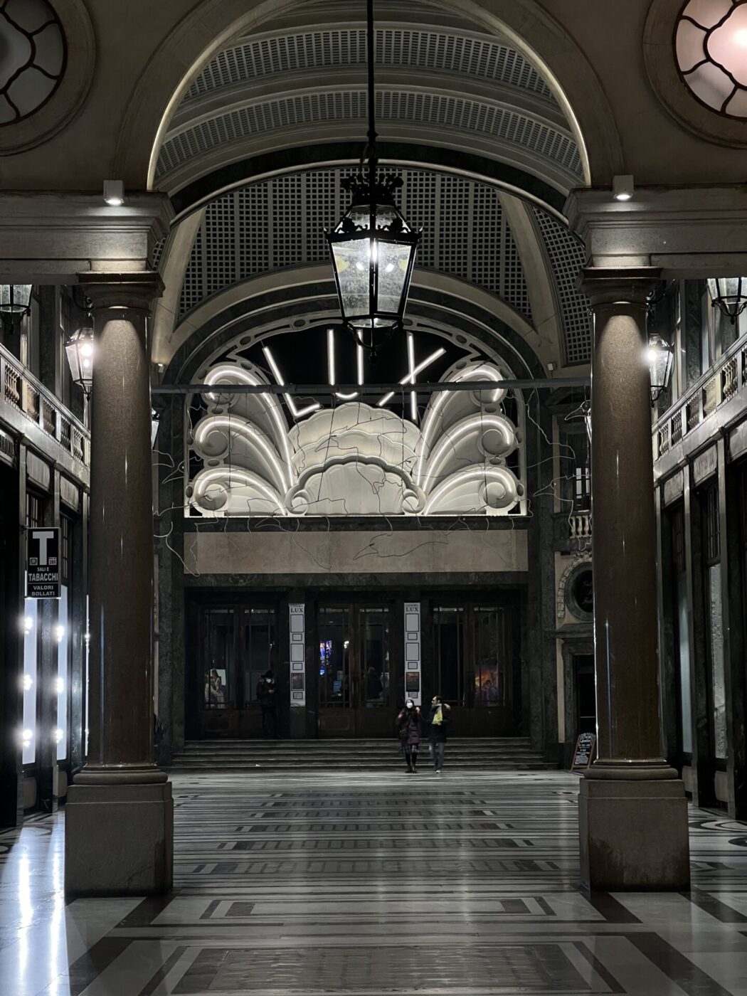
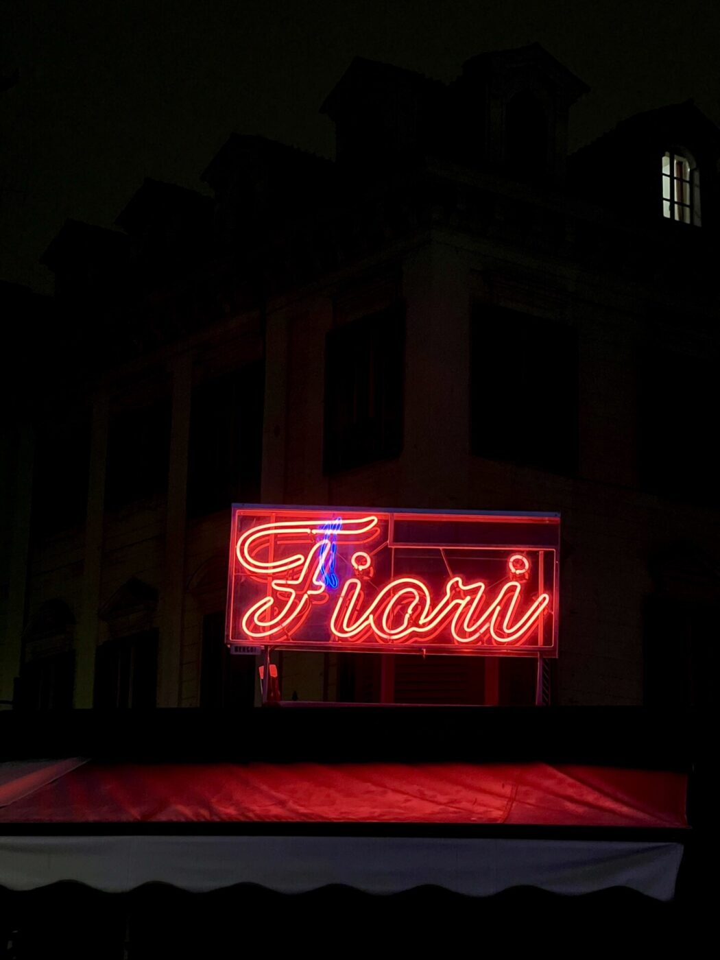
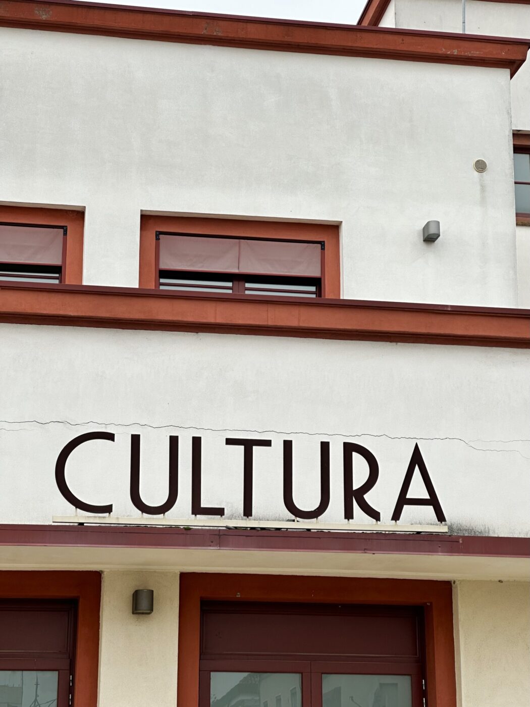
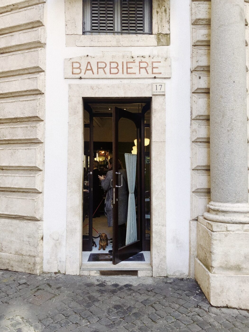
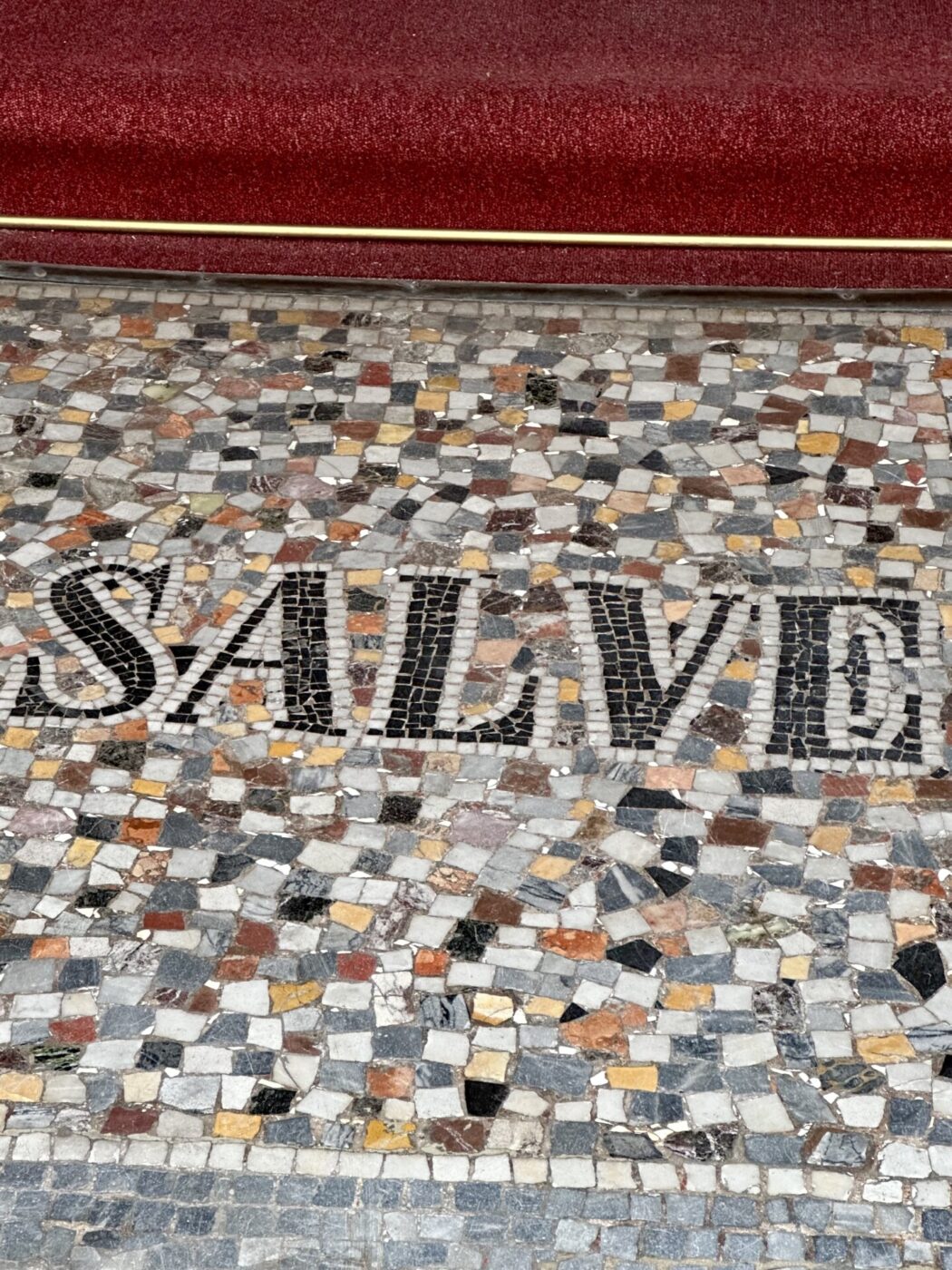
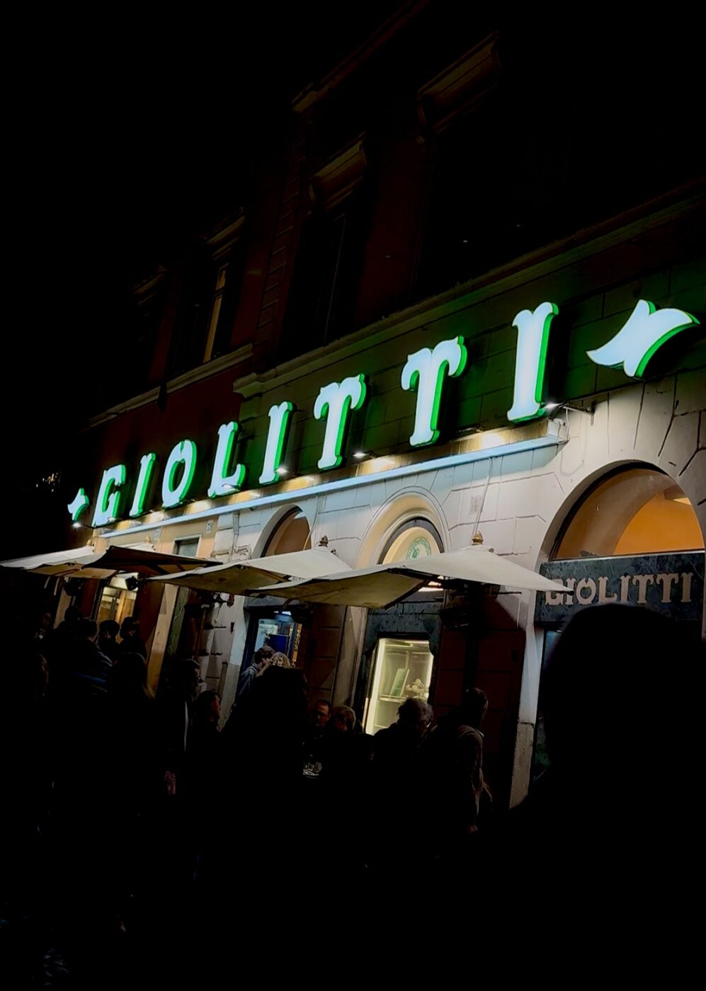
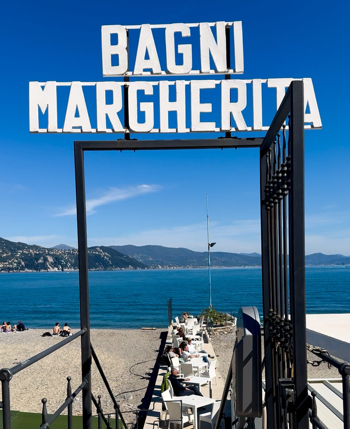
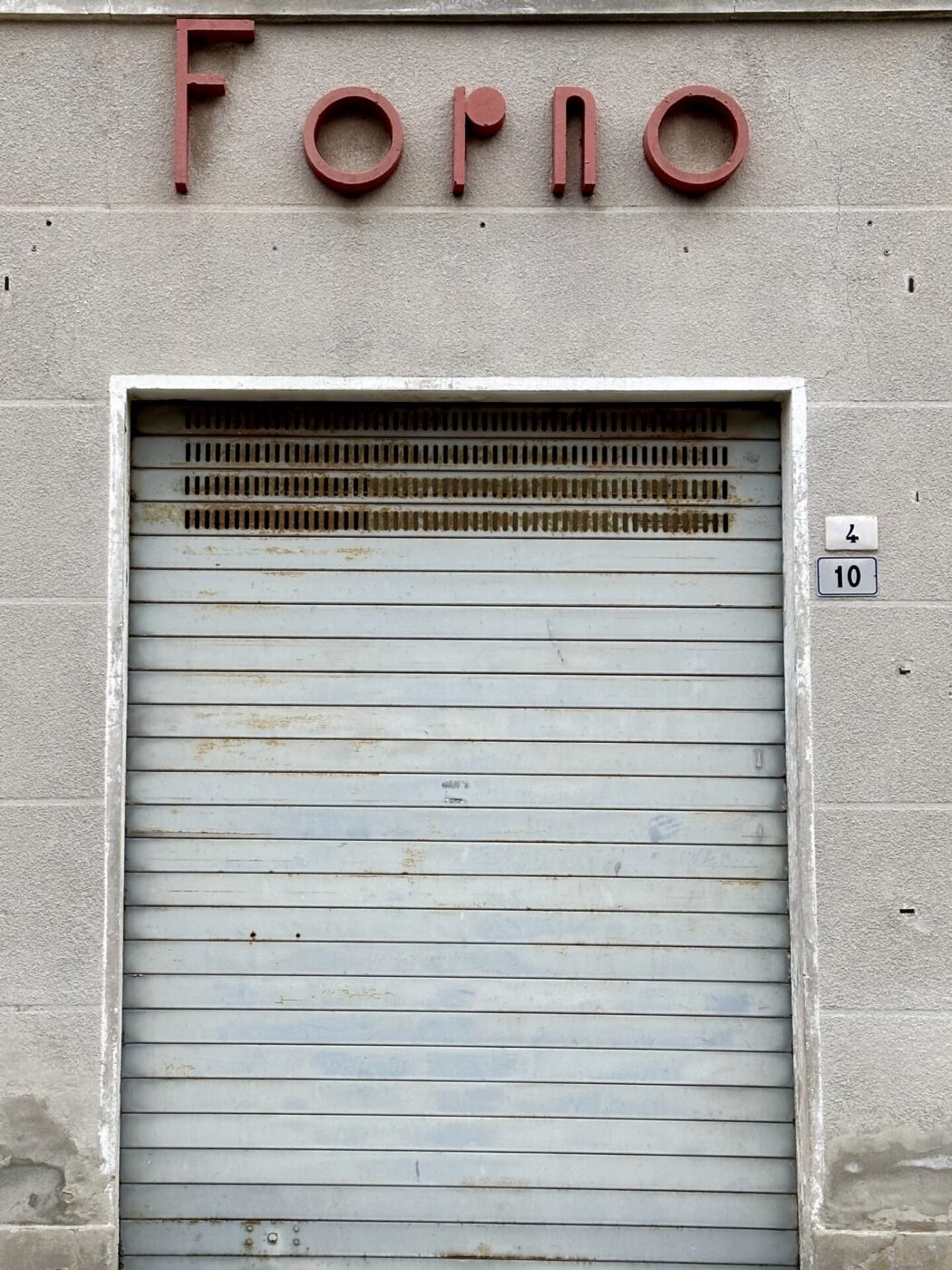
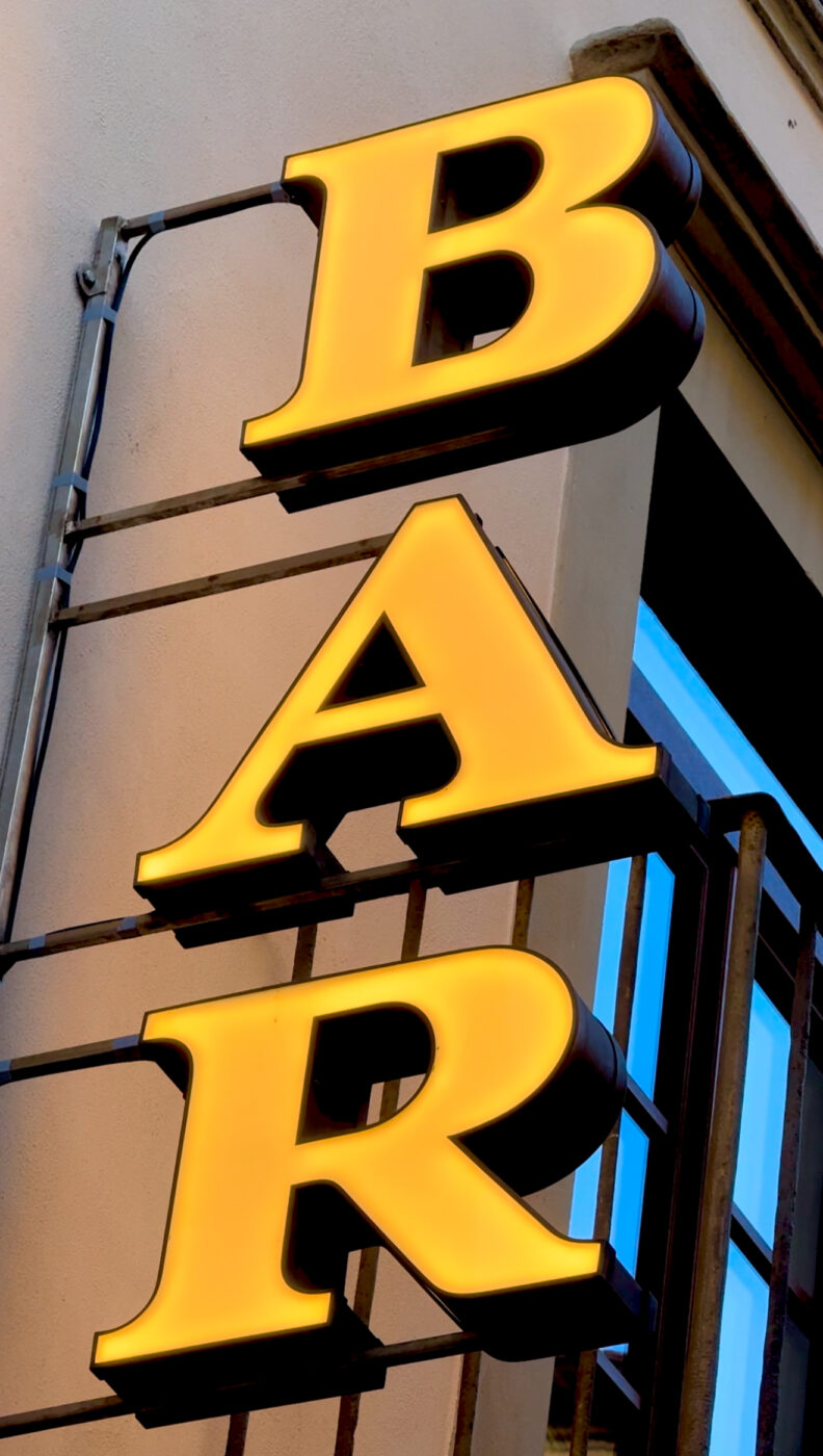
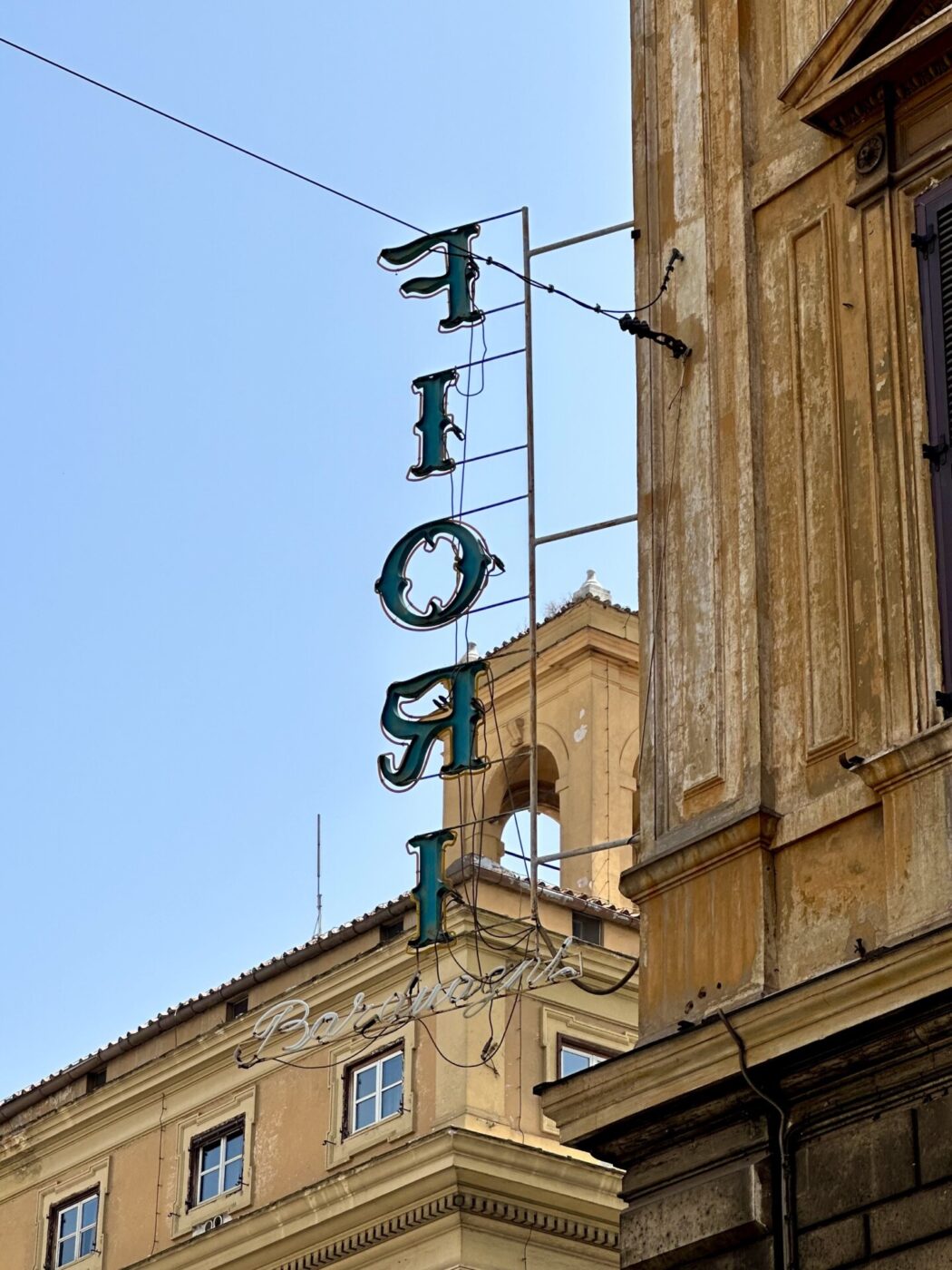
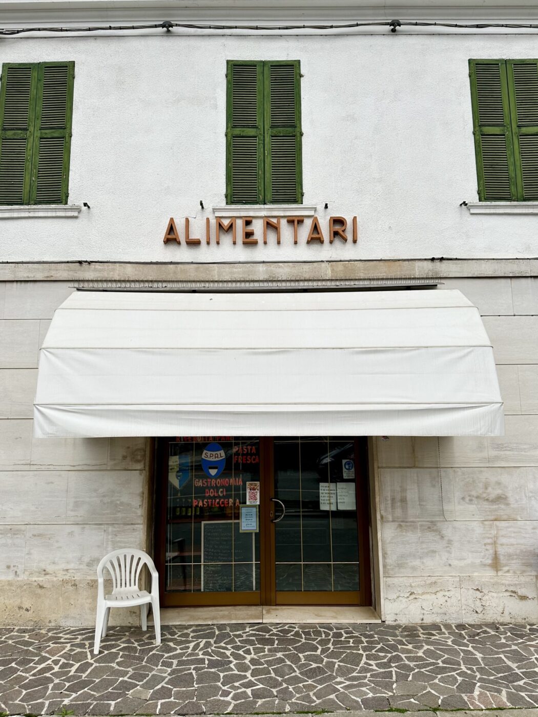
We’ve heard many call Italy an open-air museum–and though it may be the palazzi and sculptures that prompt such a remark, we urge you not to sleep on Italy’s insegne, the signs that mark restaurants and shops, metro stations and government buildings. These little works of graphic design can be found in almost any small town, but for particularly fantastic examples head to urban centers like Udine or Turin, where around 40 different styles of lettering are found on its street signs.
Professor of typography and graphic design James Clough attributes the high quality of Italian insegne to the Art Nouveau wave that swept Europe at the end of the 19th century and left a big impression on the nation’s design. Famed poster artists like Leopoldo Metlizovitz and Marcello Dudovich worked in Trieste (then part of the Austro-Hungarian Empire) and inspired a host of Italian designers in the area; it was a moment of creative freedom, and many Italian typefaces and letterforms were invented during this time, he asserts. Many influences can also be seen from early 20th century, when the Futurist movement emerged with the publication of the eponymous manifesto by Filippo Tommaso Marinetti; he rejected traditional artistic and architectural conventions in favor of celebrating the speed, energy, and innovation of the industrial age with unconventional forms and asymmetry. Other signs echo Art Deco, which came next, marked by geometric shapes and bold colors, particularly popular in urban centers like Milan, Turin, and Rome. And finally, Italian Rationalism–a response to the excesses and flamboyance of Art Deco and Futurism and a style that was often used by Fascism to reflect its ideology and aesthetics–left its mark. (Prime examples of this can be seen in places like Tresigallo and Rome’s EUR Design District.)
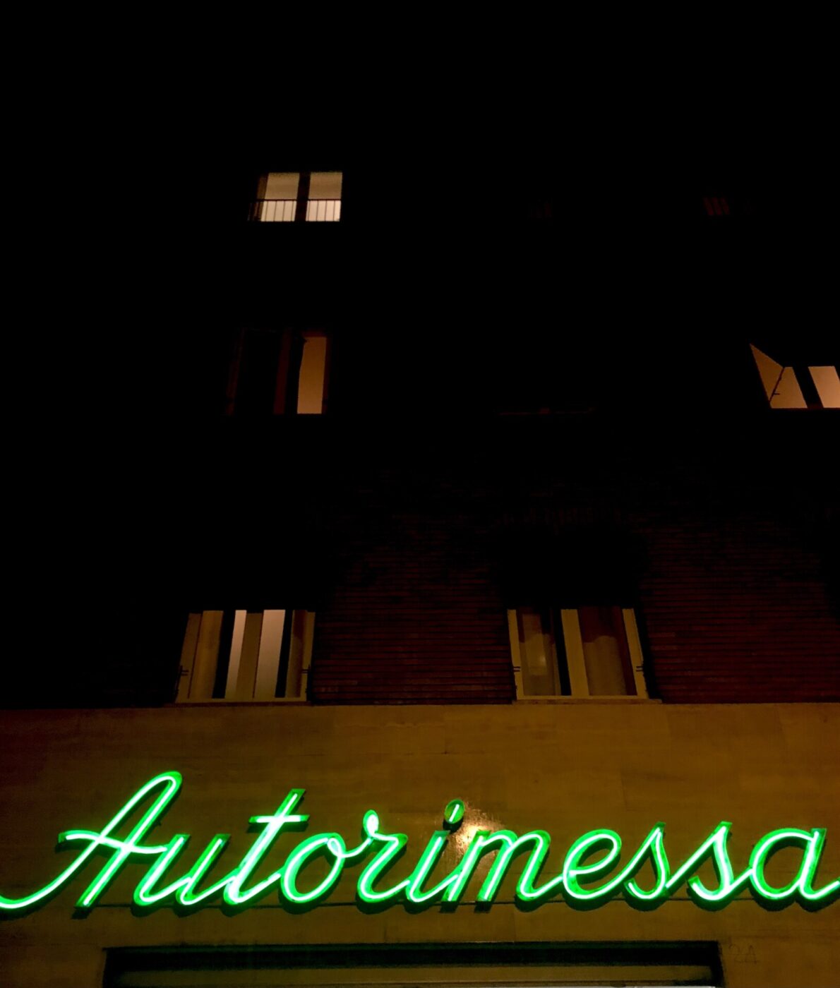
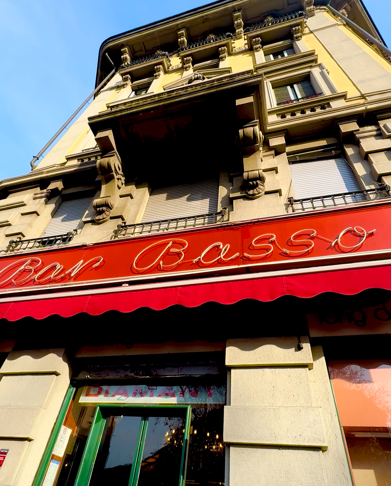
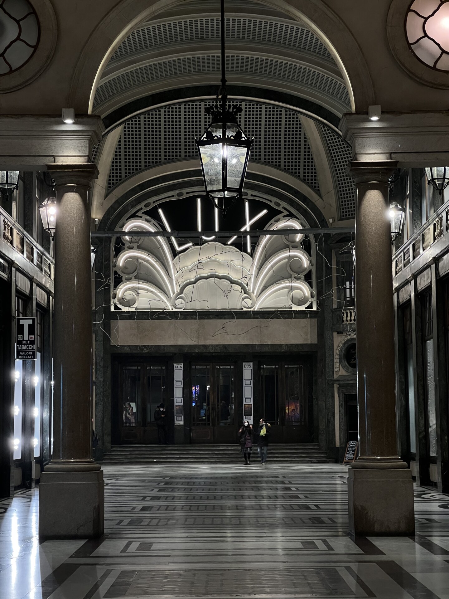
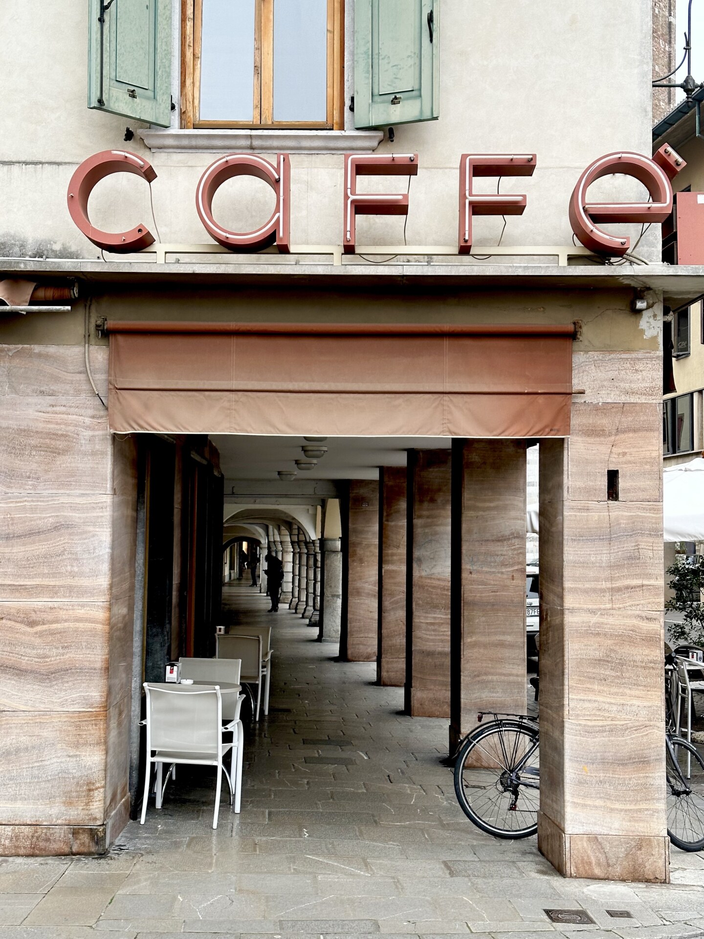
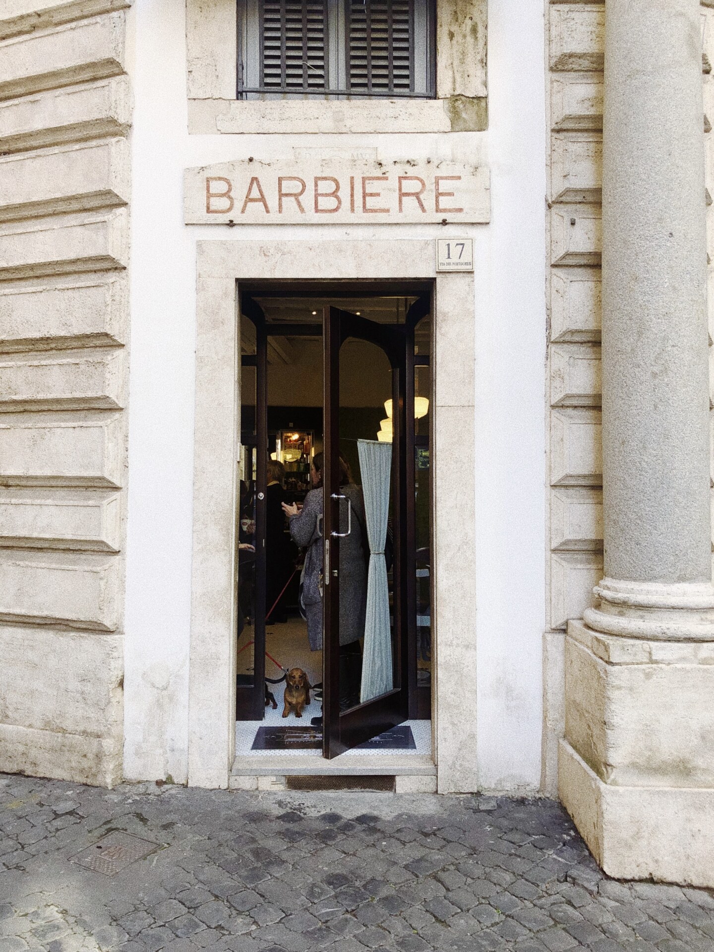
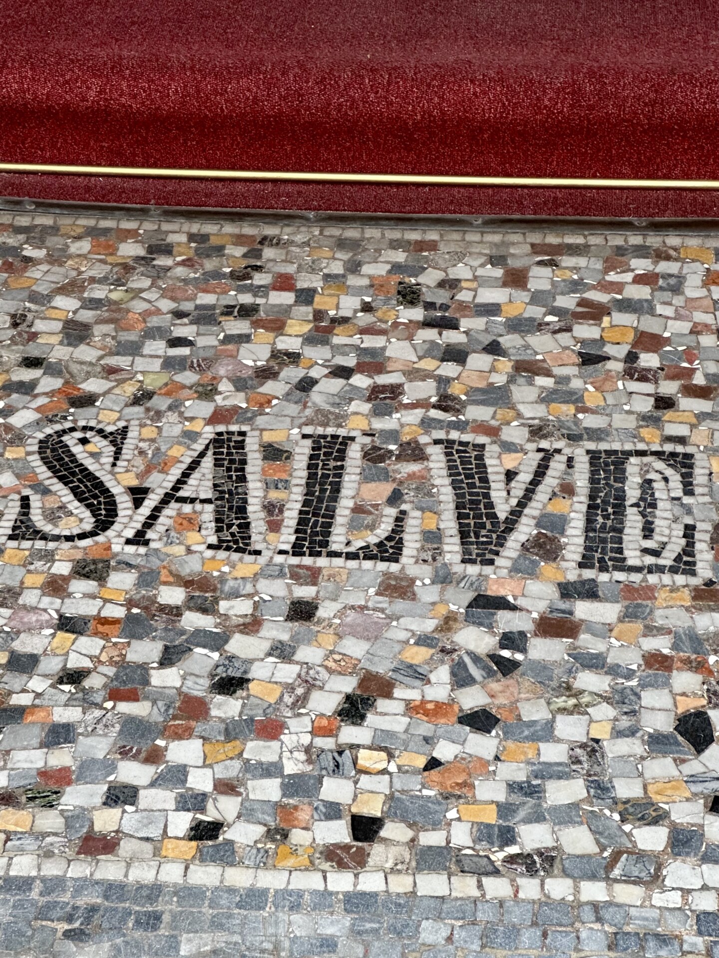
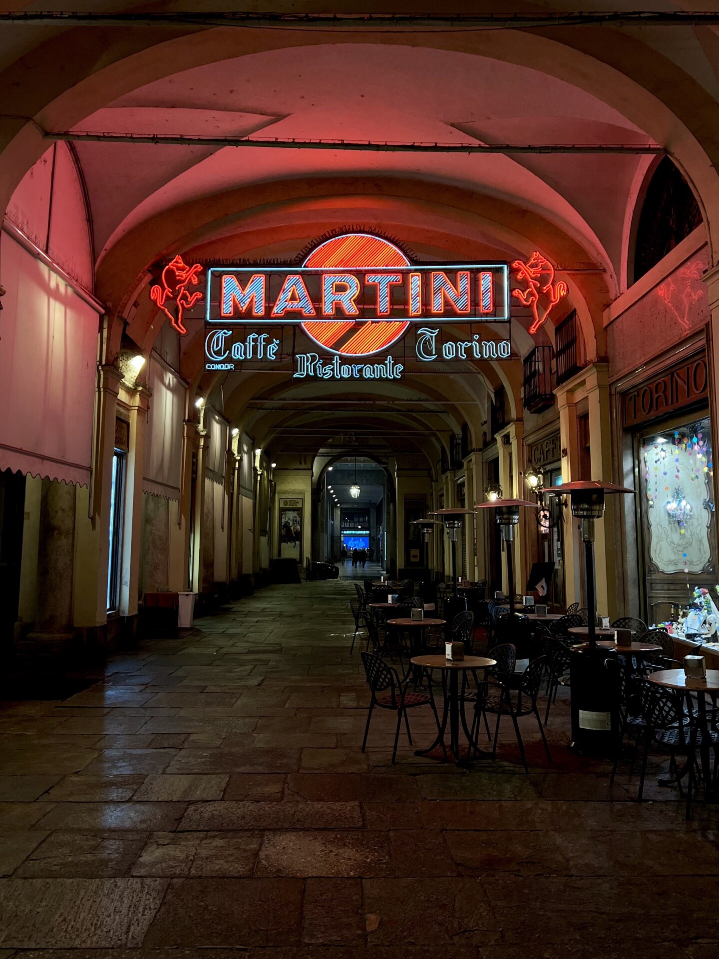
When the post-WWII economic boom hit the nation, creativity around each of these styles was given free reign, and the ferment for innovative design seeped into packaging and shop signs too. Though they may seem to be even older, many signs were designed and constructed during this period. Here, a visual journey through some of the best examples we’ve encountered across the boot:
![[Image Title] - A brick building with a Caffè sign above a patio area. Signs read Bitter Campari and laperitivo. The patio has tables, chairs, and umbrellas.](https://italysegreta.com/wp-content/uploads/2023/10/IMG_7416.jpeg)


![[Image Title] - A brick building with a Caffè sign above a patio area. Signs read Bitter Campari and laperitivo. The patio has tables, chairs, and umbrellas.](https://italysegreta.com/wp-content/uploads/2023/10/IMG_7416-1050x1400.jpeg)


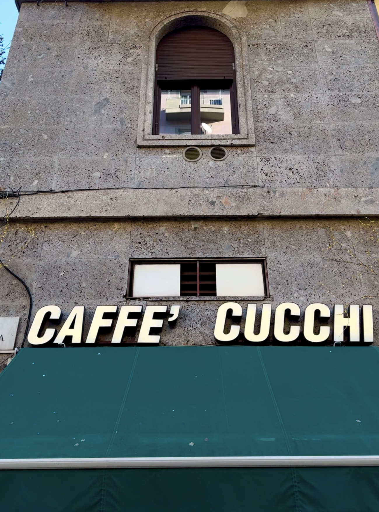
![[Image Title] - A stone building facade with a green awning below. The words CAFFÈ CUCCHI are displayed in large, bold, white letters above the awning. A small, arched window is visible at the top of the building.](https://italysegreta.com/wp-content/uploads/2023/10/IMG_3637-1037x1400.jpeg)


![[Image Title] - The image shows a store facade featuring a Kodak Films sign on top, with ottica innocenti in large brown letters. Below is a cream-colored awning with TABACCHI printed on it. (Note: Please replace [Image Title] with the actual title of the image if provided.).](https://italysegreta.com/wp-content/uploads/2023/10/IMG_7253-1050x1400.jpeg)